Conponents
Basic Elements
Banners
Buttons
Floating Action Buttons (FAB)
Dialogs
Cards
Lists
Side Sheets
Nav Drawers
Nav Rails
Date & Time Pickers
Progress Indicators
Slides
Snackbars
Tooltips、Dividers
Notices
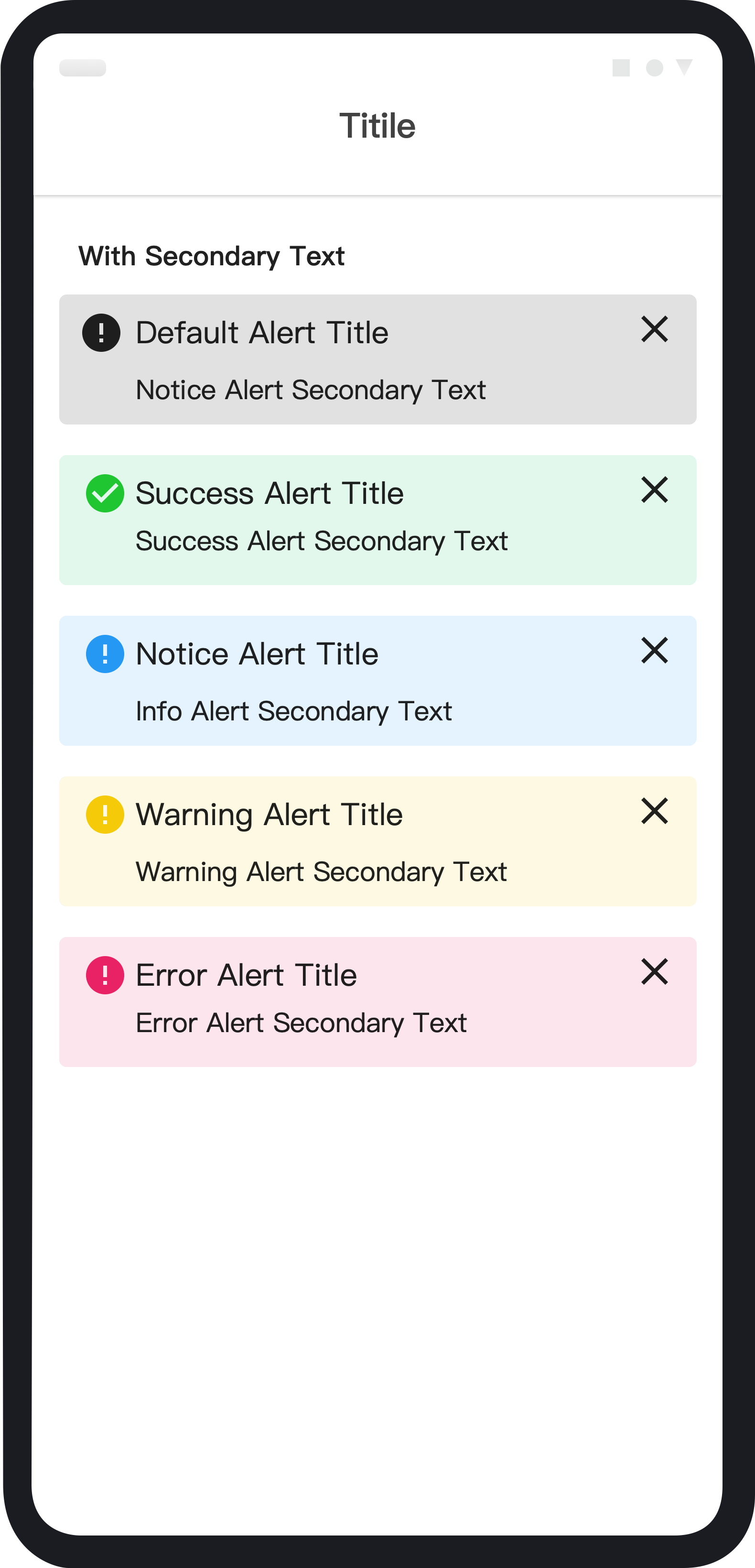
Alerts
Labels
Trees
Paginations
Badges
Avatars
Abnormals
Steppers
Cascades Selectors
Uploading
Rates
Color Pickers
Transfers
Nav Bars
Breadcrumbs
Steps
Carousels
Collapse Panels
Timelines
Dividers
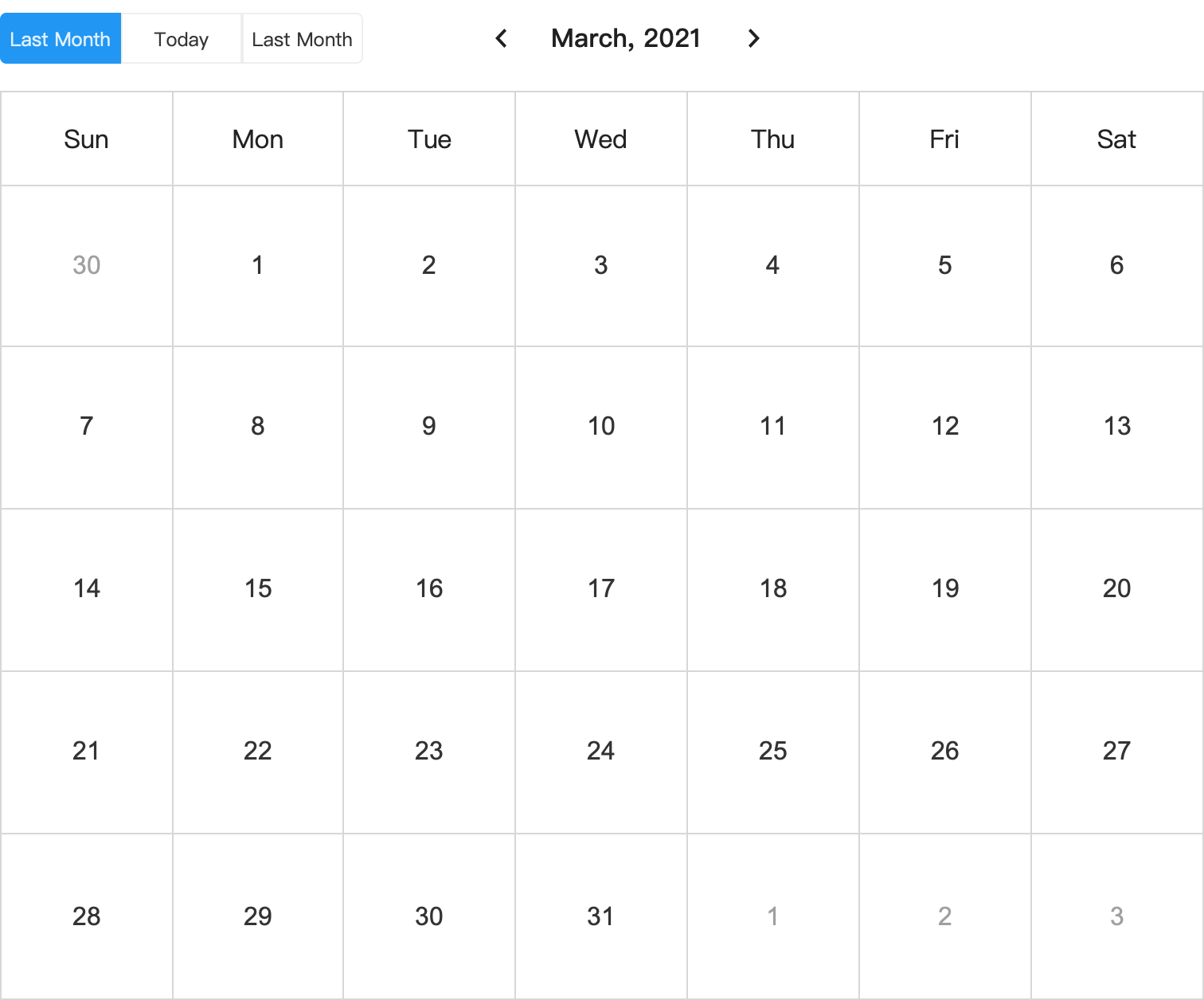
Calendars
Images
Back To Top
Text Fields
Data Tables
Chips
Image Lists
Menus
Selection Controls
Tabs
Loading & Refreshing
Conponents
Basic Elements
Banners
Buttons
Floating Action Buttons (FAB)
Dialogs
Cards
Lists
Sheets
Nav Drawers
Date & Time Pickers
Progress Indicators
Sliders
Snackbars
Tooltips、Dividers
Notes
Notices
Alerts
Labels
Paginations
Badges
Avatars
Abnormals
Loading & Refreshing
Onboarding Slides
Steppers
Rates
Breadcrumbs
Steps
Carousels
Collapse Panels
Timelines
Dividers
Calendars
Images
Back To Top
Text Fields
Data Tables
Chips
Image Lists
Menus
Selection Controls
Tabs
Top App Bars
Bottom App Bars
Bottom Nav Bars
Backdrops

Basic
Product Introduction
Global Properties
Texts
Colors
Elevations
States
Icons
Desktop
Mobile
Material Design

Material Design


Pad
Phone


Desktop
Design annotation


Presentation
Use>
交互和UI组件
Prototype
Fast create>


Coding
Fast create>
Design files


Material Design prototype+UI


Results


Component
Interactive prototype example
Aimed users and use cases
Solve pain points


UI design kit


Axure
Material Design unifies the design of each platform
We not only provides Axure prototypes, but also give you a UI design file as a gift
Design in strict accordance with official documents and Material Design principle


UX designer

Product manager


UI designer

Light Theme
Material Design


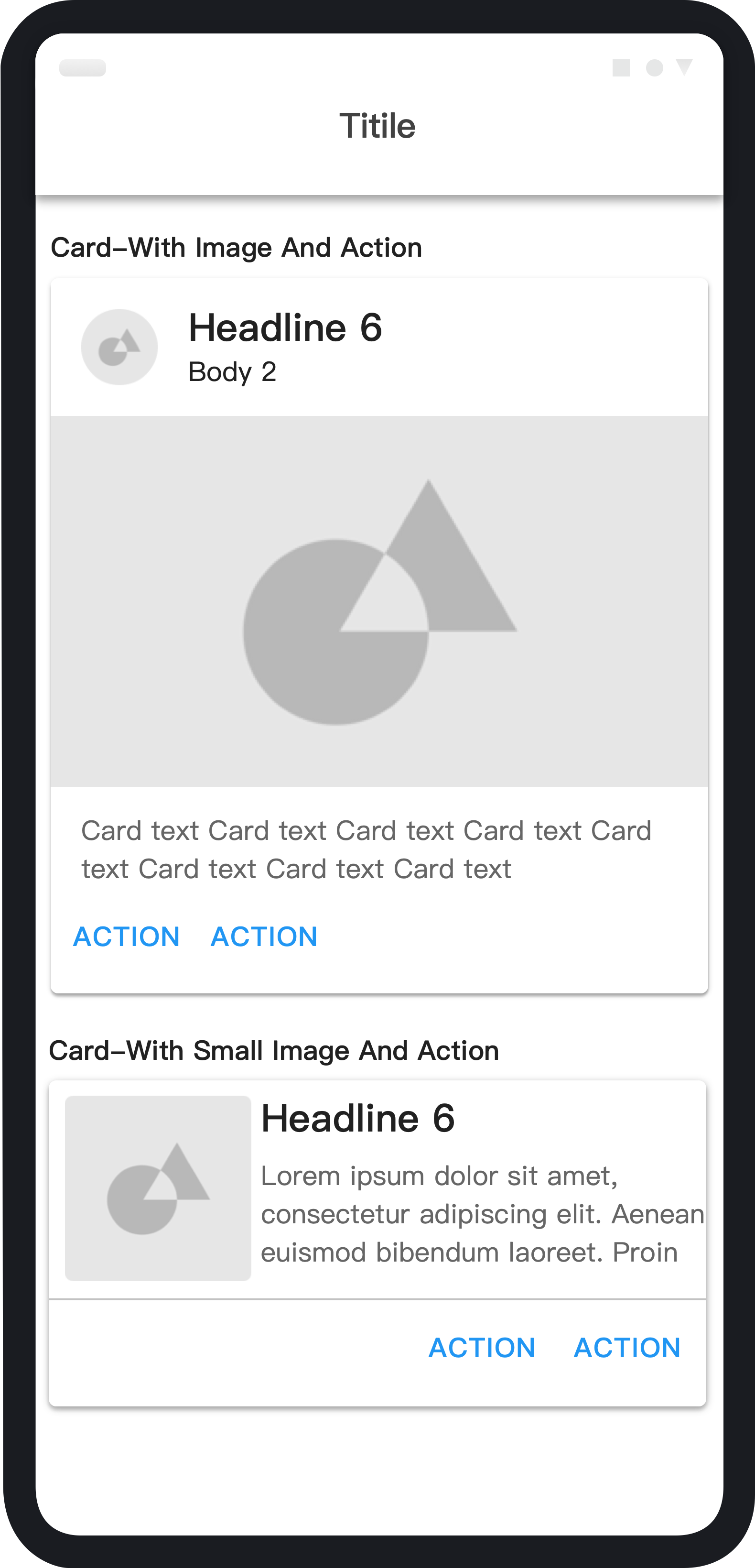


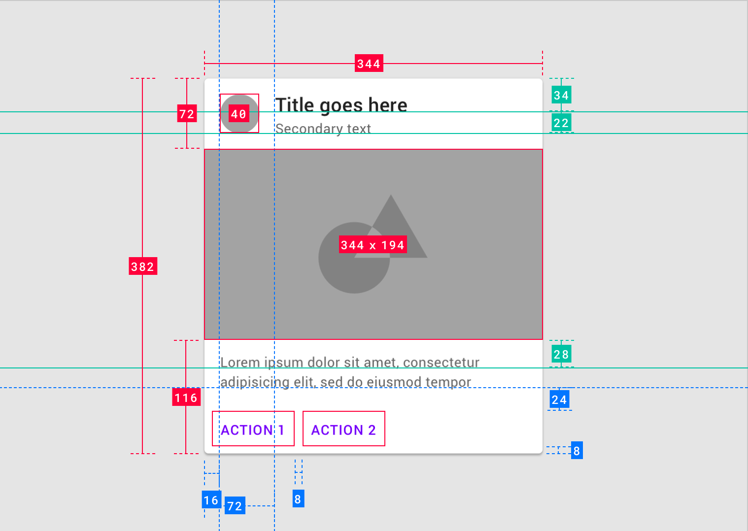
Card
Alerts
· Needs long Design time
· Not united to Design Principle
· Needs design conponents every time
· Each member has different Styles

Pain
· Time consuming is greatly reduced
· United to Design Principle
· Don’t needs design every time
· Each member has the same Style
For>
For>


Lorem ipsum dolor sit amet, consectetur adipiscing elit. Aenean euismod bibendum
Body2
Headline6

Action
Action
Colors
Texts
Grid
White space
Corner
Shadow
Gradual